Search Design System
I own several complex, high-priority UX initiatives as part of the Search Design System UX team, working with multiple partnering Design and Engineering teams to help author, deploy and refine a best-in-class design language across Search.
I currently own
-
Description text goes here
-
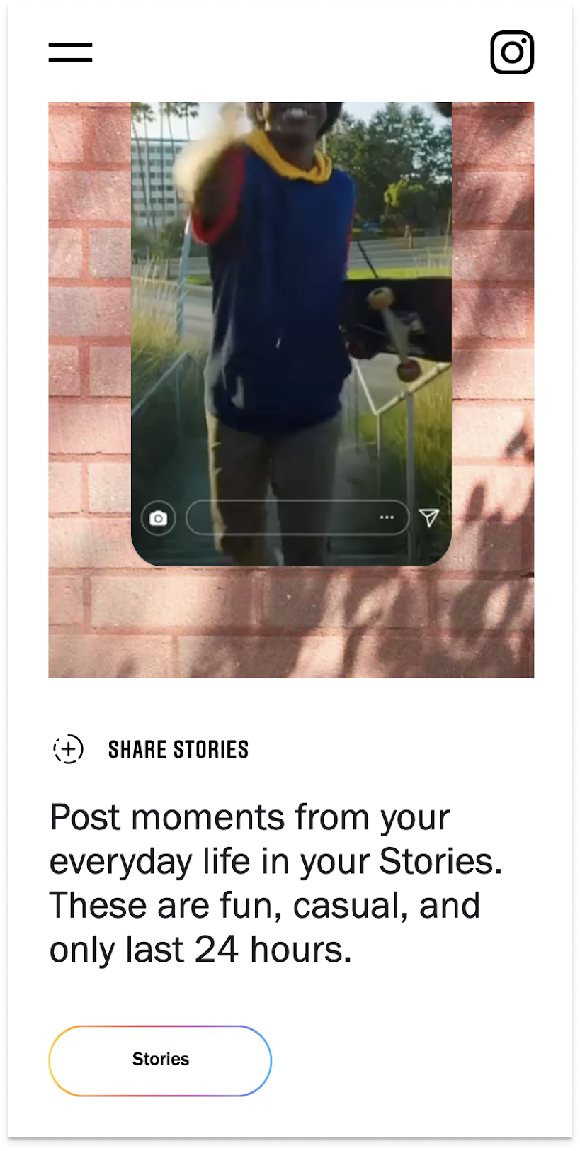
Snackable content, with the ability to expand module. Helps balance breadth vs depth of content.
-
Description text goes here
-
Item description
-
Item description
-
Item description
Bento & Bento Items
Ensure this resource conveys a reasonable understanding of Google's approach to privacy so that a user over age of consent but <18 can make informed decisions.
The Design Challenge
Explain our privacy practices covered in the Privacy Policy to <18 users, with additional ‘bite-sized’ explanations about how Google uses personal data when use is activated.
Success metrics
Teen users feel informed of Google’s privacy practices when reading the resource
Parent of teens trust this resources to educate their children about privacy at Google
Positive media about Google’s AADC response
Duration
4 months
TEAM
1 Art Director
1 UXD (Product/UX Designer & Production) (My Role)
2 Visual Designers
1 Project Manager
1 Program Manager
3 Engineers
4 UX Writers
Legal team
Software
Figma, Adobe Illustrator, Google Suite
Design Process
To start off: what currently exists?
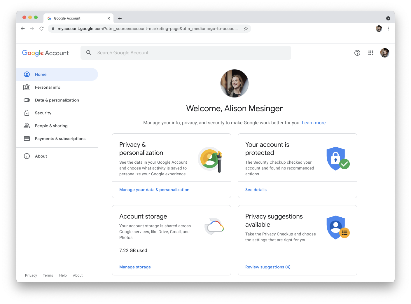
Google Account
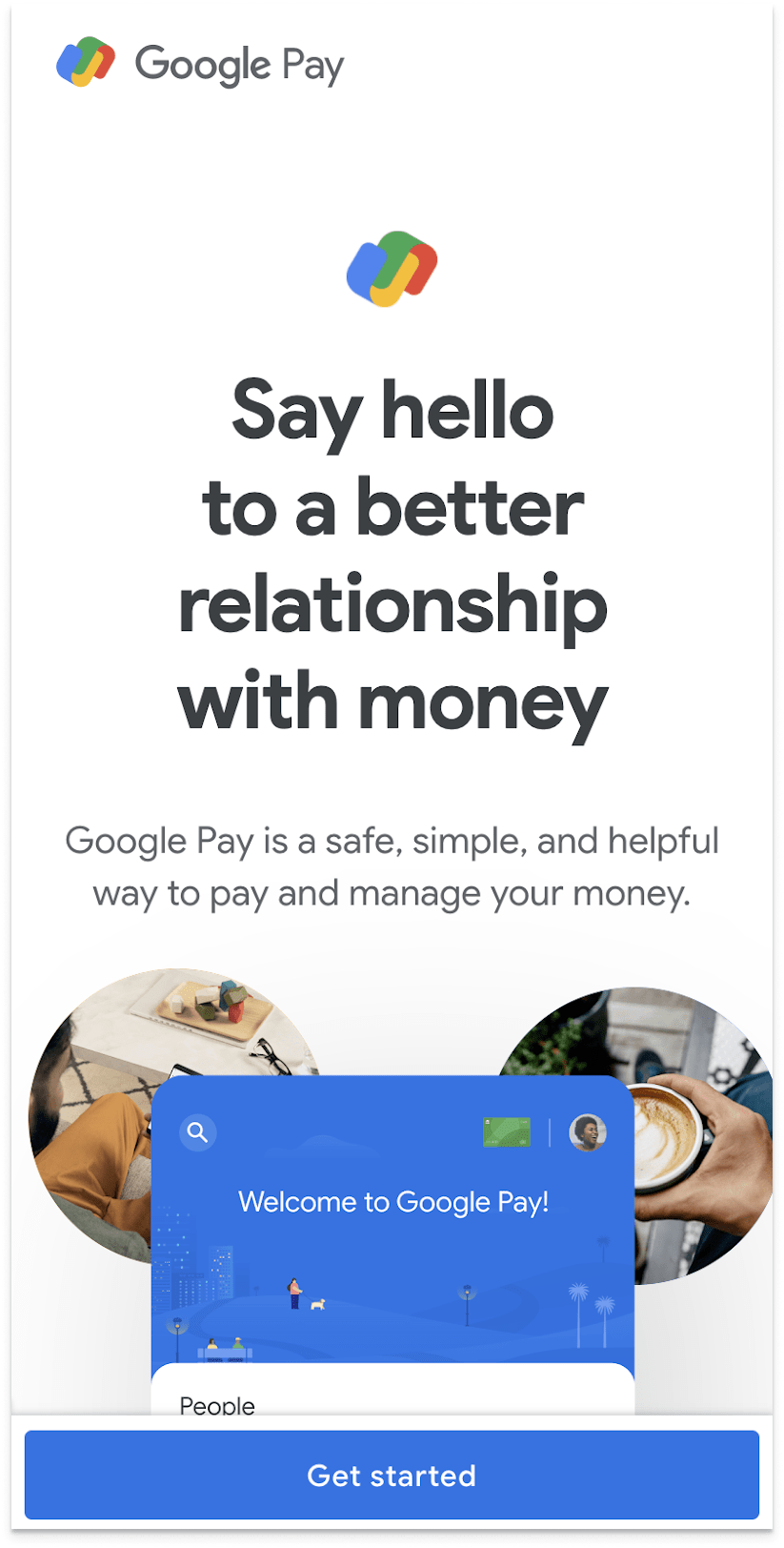
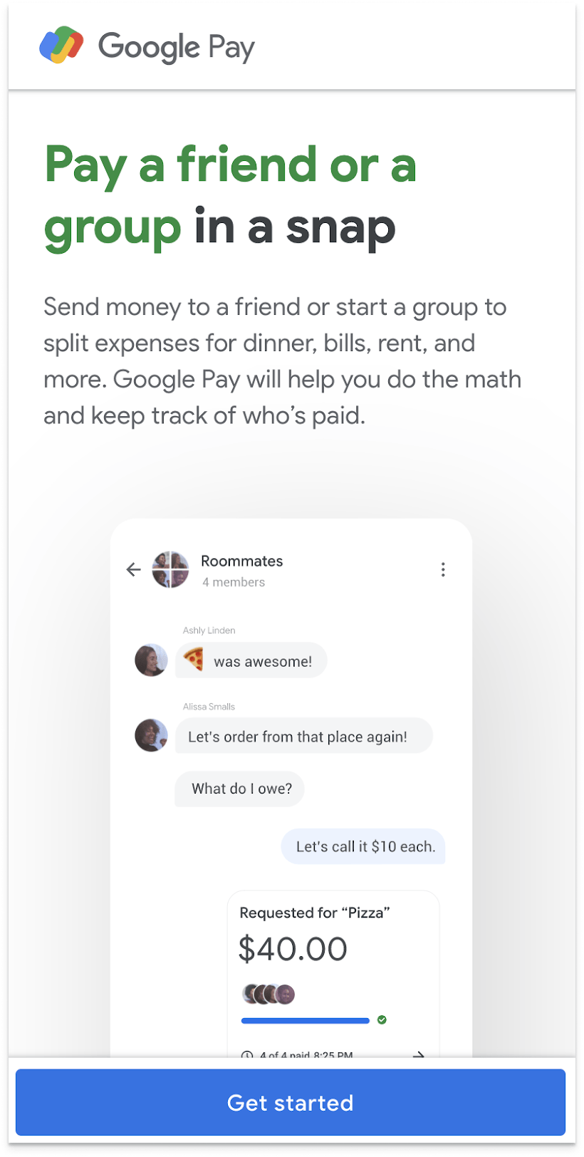
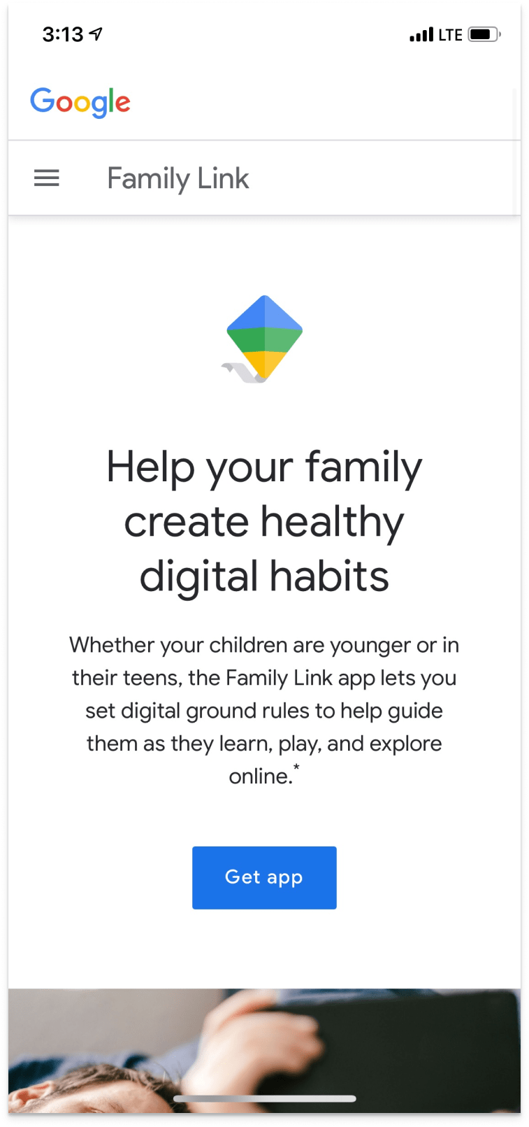
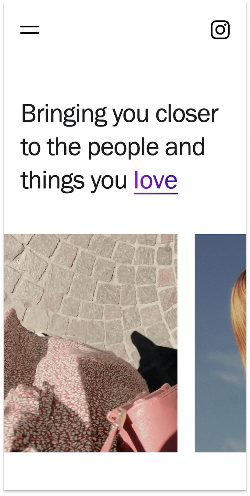
The one-stop-shop for all things “you” within Google. A great place to take control of your settings, but daunting to do so for an <18 audience.
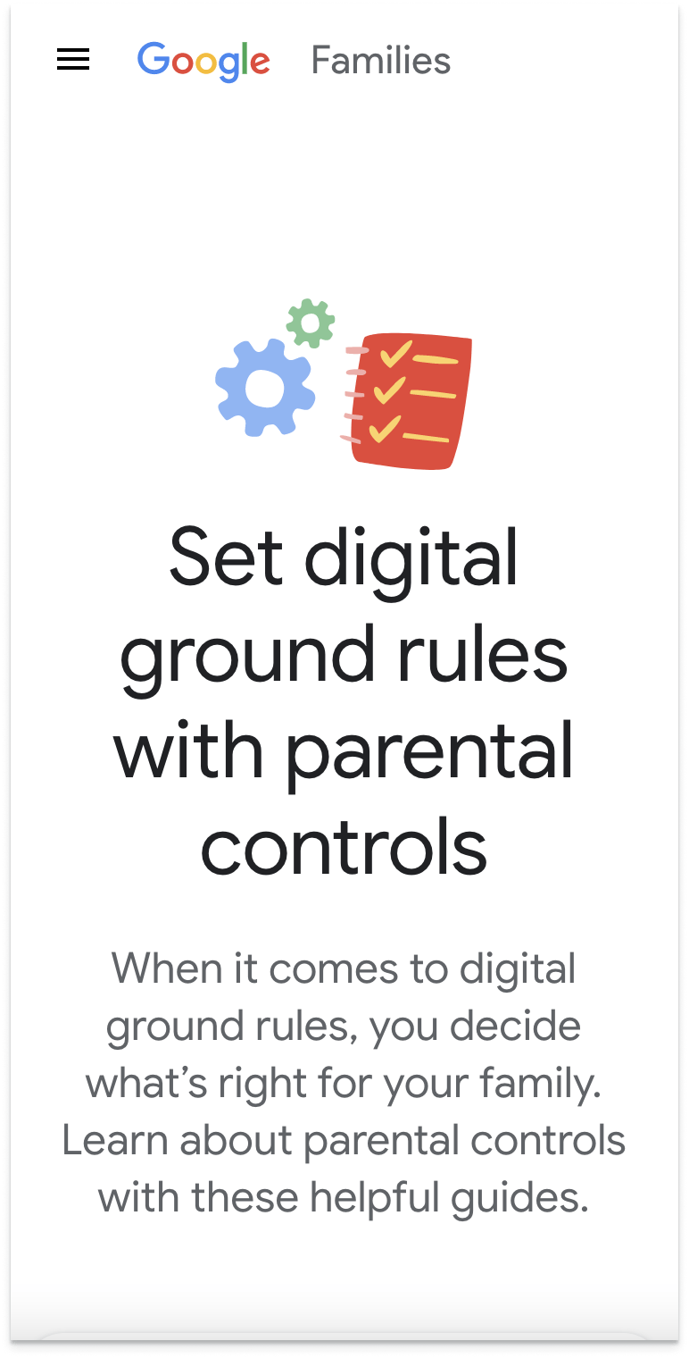
Safety Center
Largely marketing-based, this website serves more as an entry point for other resources, like the Google Account or Google’s Privacy Policy. Lots of overview information is provided, but this serves more of a launching point than a reference.
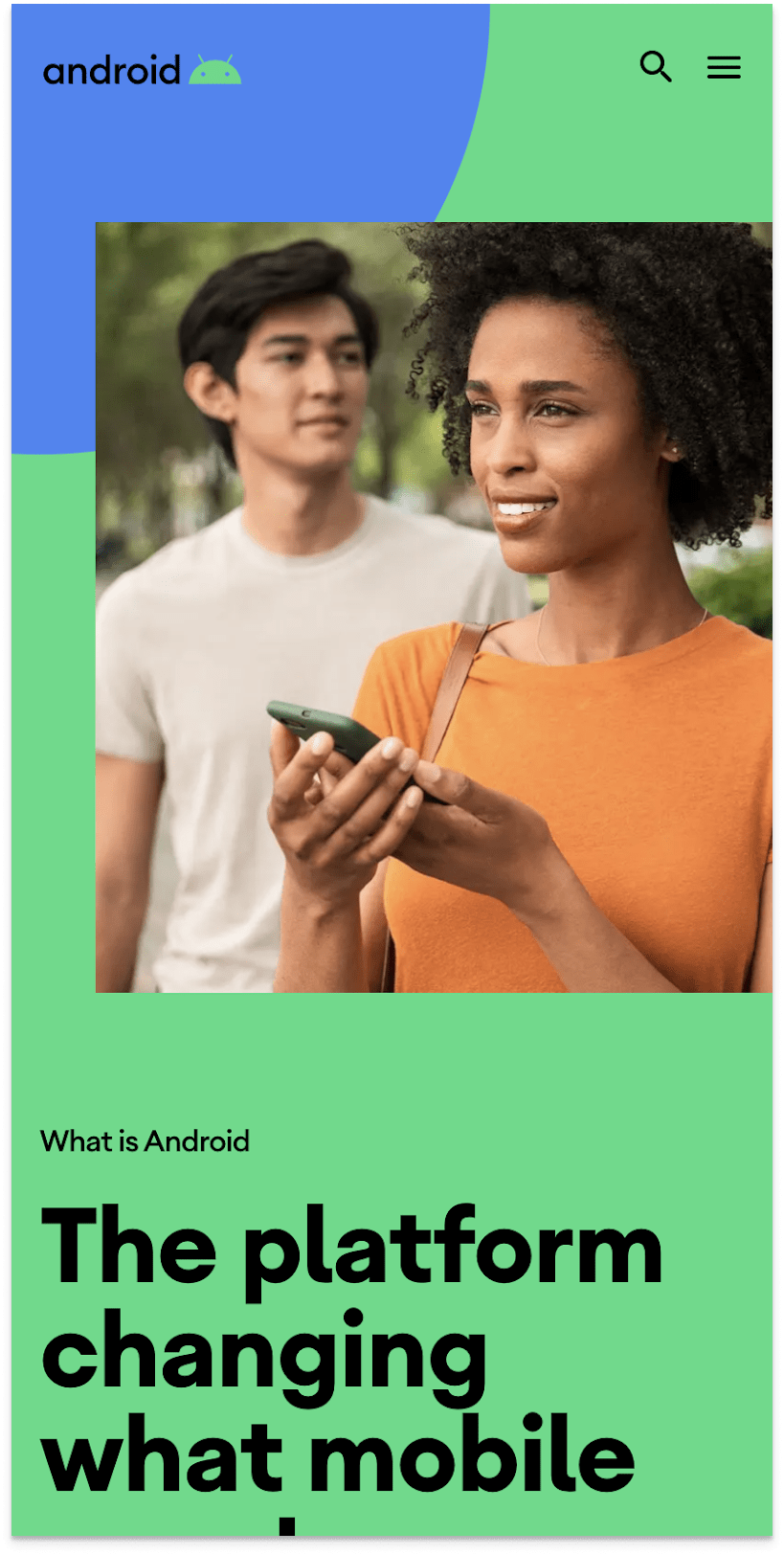
About Google
This site talks more about Google as a proactive org, highlighting philanthropic efforts, commitments, and stories about the people that work at Google, and those who benefit from Google’s involvement.
Content Curation & refinemnt
No-nonsense answers for Teenagers
UX writers and designers worked collaboratively to create a Q&A structure specifically targeted to our teenage audience. Everything from the syntax, diction, and jargon were all carefully woven to deliver a “no-nonsense” approach to privacy.
Design inspiration
Design Direction
Mobile first, web second
High contrast for legibility & glanceability
Negative space to dictate the cadence
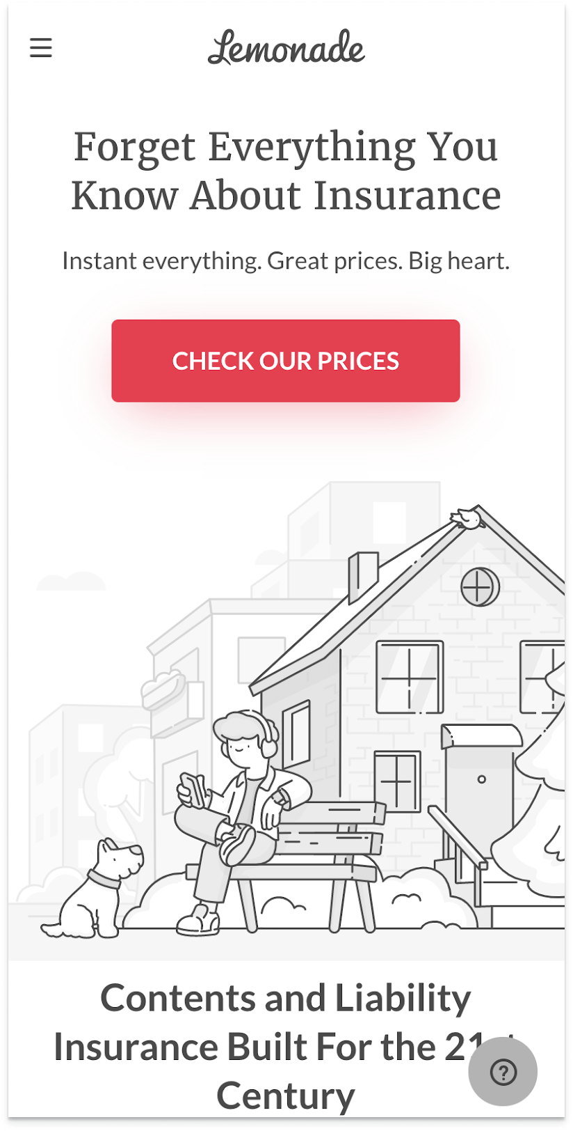
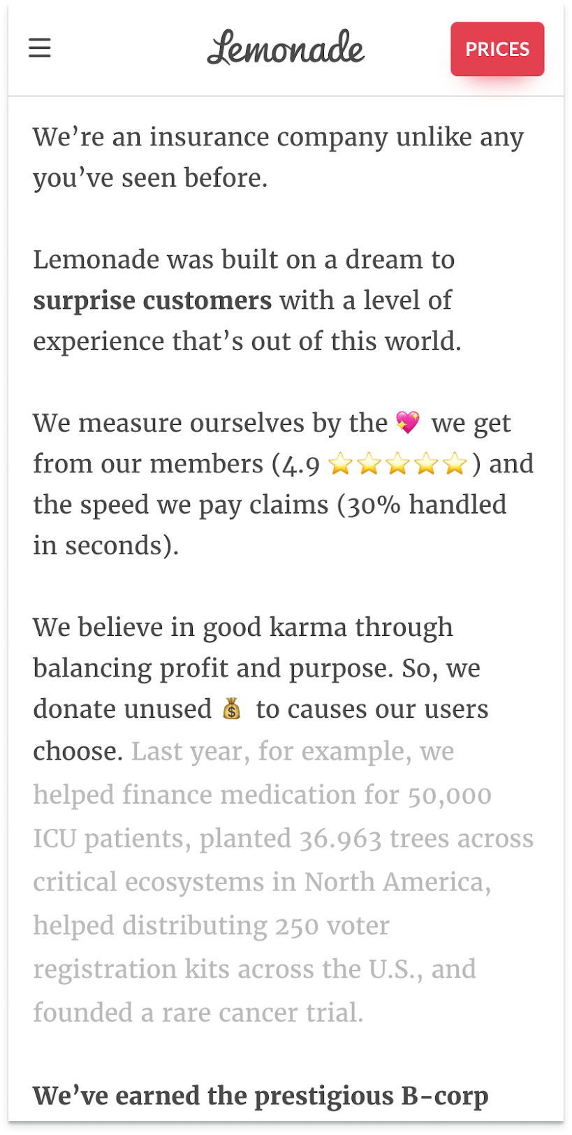
Lean into marketing: Balance visual & written content to stray from standard Q&A feel.
Wireframes
Custom-made components
FInal Designs
Post Design-handoff
Quality Assurance
After handing over all mocks, components, and type styles for web, tablet, and mobile, we wanted to keep communication fluid with the engineers. So after a first pass of development, I worked with my visual designer and project manager to devise an issue log with annotations, screenshots, and priority levels.


